Easter Color Palettes for Handmade Decorations
Five spring palettes for handmade Easter decor, a simple rule for limiting a room to three colors plus a neutral, and a quick way to test a scheme first.
Choosing an Easter color palette before you cut or paint anything is the quickest way to make handmade pieces look as if they belong together. A garland, a bowl of eggs and a wreath made on three different days will still read as one scheme if they share the same few colors.
The five palettes below all work with common craft paints, cardstock and felt. Each comes with a note on where it suits best, followed by a simple rule for limiting colors and a way to test a scheme before you commit to it.
The rule of three colors plus a neutral
Most rooms look calm with three colors and one neutral. More than that and handmade decor starts to look like leftovers from several projects.
- The main color covers about half of what you make.
- The second color covers about a third.
- The accent appears in small touches: a ribbon, one egg in a bowl, the center of a flower.
- The neutral (white, cream, natural wood, twine or linen) fills the gaps and gives the eye a rest.
The proportions do not need to be exact. What matters is that the colors are not used in equal amounts, because an even split tends to look busy.
Five palettes that work
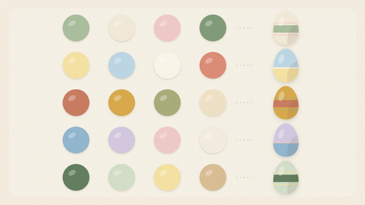
1. Soft pastel
Blush pink, butter yellow and sky blue with white. This is the classic spring scheme. To keep it grown-up, choose pastels that are slightly dusty rather than candy bright, and let white do a lot of the work. It suits paper garlands and eggs in a white bowl.
2. Sage and cream
Sage green, cream and a small amount of blush, with natural wood as the neutral. Quiet and easy to live with, this palette sits comfortably beside houseplants, linen and wooden furniture. It is a strong choice for wreaths, because real or faux greenery already matches.
3. Blush and terracotta
Blush pink, terracotta and a warm peach, with cream. Warmer and earthier than pastels, it works well in rooms with brick, clay pots or warm wood floors. Terracotta is strong, so use it as the second color or the accent rather than the main one.
4. Blue and white
Mid blue, pale blue and white, with a touch of soft gray. This scheme borrows from painted china and looks crisp on a table. Fine brush patterns show up clearly in blue on white, which makes it a natural fit for painted wooden Easter eggs.
5. Yellow and gray
Butter yellow, soft gray and white, with a darker charcoal used sparingly. Gray calms the yellow and gives the scheme a modern feel. It suits simple shapes: plain eggs, bold bunny silhouettes and striped ribbon.
| Palette | Main color | Accent | Neutral |
|---|---|---|---|
| Soft pastel | Blush pink | Sky blue | White |
| Sage and cream | Sage green | Blush | Natural wood |
| Blush and terracotta | Blush pink | Terracotta | Cream |
| Blue and white | Mid blue | Soft gray | White |
| Yellow and gray | Butter yellow | Charcoal | White |
Using the color wheel to find pairs
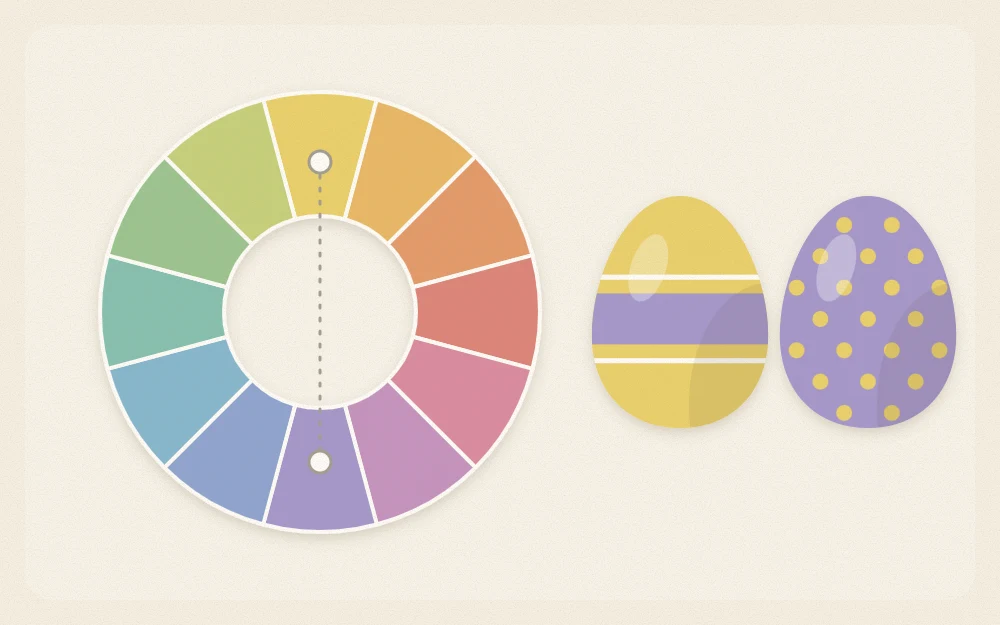
If none of the five suits your room, a color wheel will help you build your own. Two relationships are the most useful for decorating.
- Neighbors: colors that sit side by side on the wheel, such as yellow, yellow-green and green. They blend quietly and rarely clash.
- Opposites: colors that face each other, such as blue and orange or pink-red and green. They make each other look brighter, so one should be used in a much smaller amount than the other.
For spring decor, soften whichever colors you pick. Mixing a little white into a craft paint turns it into a pastel, and a tiny amount of its opposite color dulls it slightly. Blush and sage are simply softened versions of red and green, which is why they sit so well together.
Start from what the room already has
Your walls, sofa and rug are part of the palette whether you plan for them or not. Look at the largest surfaces first and choose a scheme that includes one of those colors, or at least does not fight it. A gray sofa already supplies the neutral for yellow and gray. Warm wood shelves suit sage and cream or blush and terracotta.
The same thinking applies to the table. If your plates and linens are fixed, build the palette around them; the guide to Easter table decor ideas shows how to carry a scheme from the centerpiece to each place setting.
Test before you commit
- Paint a swatch of each color on white paper, roughly 2 in (5 cm) square, or cut squares from your cardstock and felt.
- Let the paint dry fully; many craft paints dry a shade darker. Drying takes roughly 20 to 30 minutes, but check the label.
- Lay the swatches side by side in the proportions you plan to use: large, medium, small.
- Carry them to the spot where the decorations will go and look at them in daylight and again in the evening.
- If one color jumps out, swap it for a softer version or demote it to the accent.
Tip
Paint one spare craft egg in each color and keep the set. It is a truer test than paper, because the curve of an egg shows how a color looks in light and in shadow.
Carrying the palette through the house
Once a palette is settled, write the colors down or keep the swatches in your supply box. Use them for everything made this season, including small things that are easy to forget, such as ribbon, tags and paper. Even wrapped presents can follow the scheme; see the Easter gift wrapping ideas for ways to use the same colors on baskets and parcels.
Frequently asked questions
What colors go together for Easter decorations?
Soft versions of spring colors combine easily: blush pink, butter yellow, sky blue and sage green all sit well with white or cream. For a calmer look, pick sage, cream and a little blush. For something crisper, use two blues with white, or butter yellow with soft gray.
How many colors should an Easter scheme have?
Three colors and one neutral are enough for a room. Use one as the main color, one in a smaller amount and the third only as an accent. The neutral, such as white, cream, linen or natural wood, fills the space between them and keeps the display from looking crowded.
How do I make craft paint look like a pastel?
Add white a little at a time until the color is as pale as you want, then mix enough for the whole project so the shade stays consistent. To take away any candy brightness, stir in a very small amount of the color opposite it on the color wheel.